MEISSEN REBRAND
THE BRIEF
Meissen is a South African bathroom-ware company specialising in high-end taps, shower heads, and accessories. While already established as a cost-effective brand, the goal was to position Meissen as a more luxurious and elegant choice, offering designer products at accessible prices. My role was to evolve the brand identity to capture this balance - maintaining affordability while elevating the narrative of sophistication and timeless design.
THE SOLUTION
Meissen’s previous identity was highly minimalistic, relying on a stark black-and-white palette and clean, clinical imagery. To elevate the brand and infuse a sense of luxury, I introduced warmer tones, refined typography, and bespoke patterns. The visual direction was further enhanced through rich, aspirational imagery created
using photography, Photoshop, AI, and 3D rendering. The result is a brand that feels luxurious, memorable, and aspirational - while still remaining accessible.
EXAMPLE OF PREVIOUS BRAND IDENTITY

MY SOLUTION
Subtle changes that elevate the look from minimal to luxurious
Updated Iconography single line, subtle and monochromatic


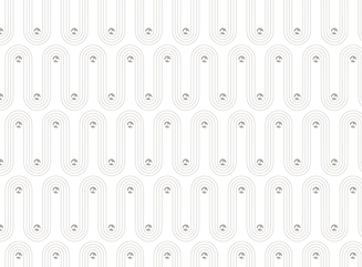
Signature pattern
Art deco inspired pattern creates understated luxurious feel while strengthening the brand recognisability.
Warm Colour Palette
Soft sands and warm golds add a touch of luxury without changing the brand extensively.

NEW DELIVERABLES
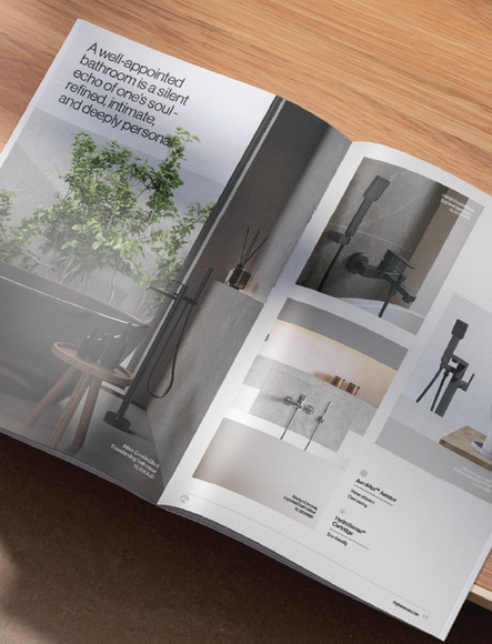
I created a new visual style through photography, photoshop, Ai and 3D rendering.


